Zaeon Labs is a full-stack creative studio. They build web apps, mobile apps, websites, brand work, and Discord ecosystems. They came with a clear need. A website that made a stranger believe in the studio before a single conversation happened. Not a brand overhaul. A site that proved, on sight, that this studio is serious about its craft and still enjoys the work.
The brief
Zaeon Labs already had a logo, a simple wordmark, and it worked. They were clear about one boundary from the start. They did not want their brand colors or identity touched. As a creative studio, they wanted to make those calls themselves, and that boundary actually sharpened the job. It drew a clean line around what really mattered here. The website.
And the website had one thing to prove. That this studio works in a structured, strategic way and genuinely delivers, rather than just talking a good game. A lot of studios can claim they are serious. Far fewer can make you feel it the moment the page loads.
The weekender identity
Zaeon Labs has a philosophy built into who they are. They are weekenders. The studio runs at full intensity on weekends, and rather than hide that, they made it part of their identity. It is not a limitation. It is a stance. The work happens when the focus is sharpest, when the noise of the week falls away and there is nothing left but the build.
That identity shaped the tone I designed toward. Confident without shouting. Focused without being cold. A studio that does not need to be loud every day, because when it shows up, it shows up completely.
Structure as the argument
The site is built on a deliberate grid, and that was the entire strategy. A creative studio has to prove two things at once. That they have ideas, and that they can deliver them. Ideas are easy to claim. Structure is harder to fake.
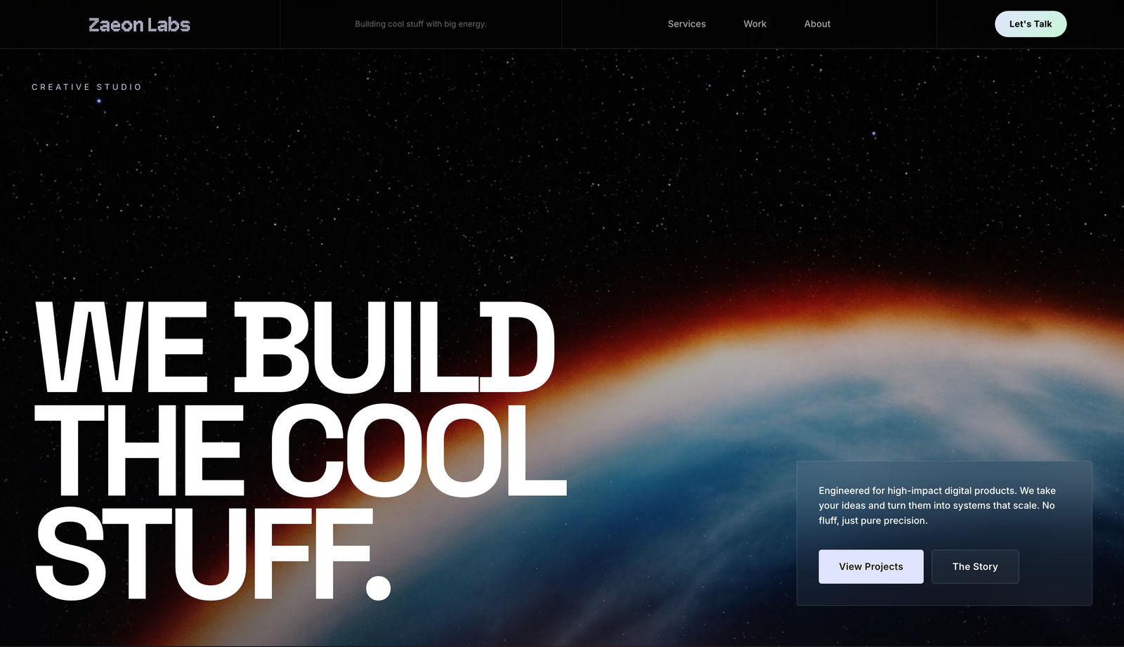
So I let the grid carry the argument. Clean columns. Deliberate spacing. Every section laid out with the kind of order that quietly tells you this studio thinks clearly and works methodically. But a grid on its own can feel stiff, so the personality lives in the type and the pacing. Bold statements given room to breathe. Lines that stand alone with confidence. A planet-scale boldness in the hero that says they build the cool stuff and means it.
The build
The site opens on a statement instead of a sales pitch, a bold line set against a planet, telling you immediately that this studio is not timid. From there it moves through services laid out in a clean, structured grid, each discipline given its own clear space so the layout itself signals how organised the thinking is.
The rhythm matters as much as the grid. Moments of quiet, moments of boldness, space that lets each section breathe. The whole scroll is built to feel like walking through a studio that has its act together, where nothing is accidental and everything is deliberate. The work reads as strategic because the design itself is strategic.
Live
The most interesting constraint turned out to be the best one. Being asked not to touch the brand forced the website to carry the entire argument on its own. No new colors to hide behind, no identity refresh to lean on. Just structure, type, space, and intent doing all the talking.
That made the work sharper. When you cannot change everything, you get ruthless about the things you can change. The result is a site that feels less like a portfolio and more like proof.
The Zaeon Labs site is live at zaeonlabs.com.