Most workplace software treats people like resources to be managed. Rows in a table. Names in a directory. Tasks to be assigned and tracked. I wanted to design the opposite of that. Helios started as a question I could not shake. What if the platform a company runs on actually made it feel like a community instead of a spreadsheet. This case study is still in progress. You are seeing the work as it happens, honest and unfinished.
The problem with workplace tools
Every internal tool I have used picks a side and fails the other. The admin-heavy ones are built for control. Dashboards full of metrics, headcounts, and status fields, designed for the person at the top and nobody else. The employee never feels seen, only counted.
The lighter ones swing too far the other way. Friendly, chat-first, but shallow. No real structure underneath, no way for a manager to actually assign work or track a project without bolting on three more apps.
What almost nobody builds is the thing in the middle. A platform that respects the manager's need for structure and the employee's need to feel like a person. Helios lives in that gap on purpose.
Three people, three needs
The hardest part was accepting that one screen could not serve everyone. A company is not one user. It is at least three, and they want completely different things.
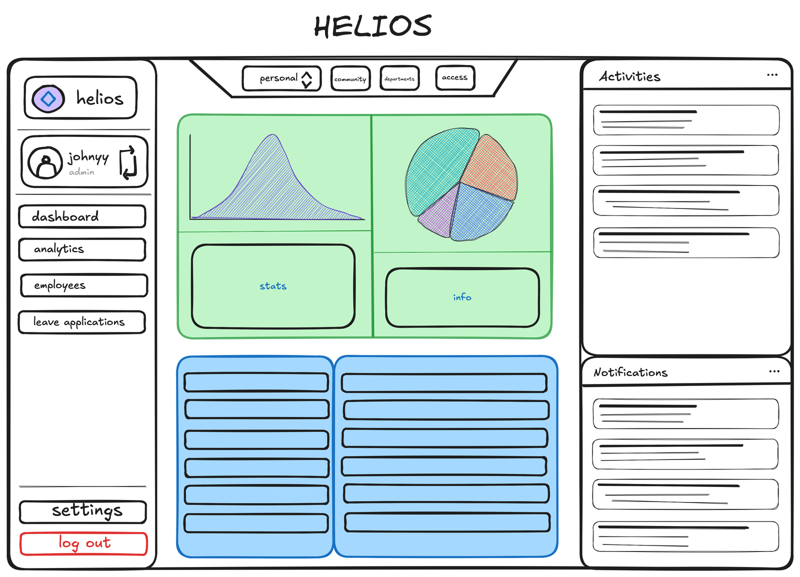
The Admin needs the aerial view. Who is here, how teams are doing, where the friction is. The Manager needs control without chaos. A clean way to assign tasks, track projects, and see their team without drowning in noise. And the Employee, the person every other tool forgets, needs to feel connected. To their work, to their team, to the company itself. So Helios became three role-based modes sharing one calm design language, each one shaped around what that person actually walks in needing.
Designing for community, not control
This was the decision that defined everything. Most platforms bury communication somewhere in a corner. Helios puts it near the center. Cross-department channels so the design team and the engineering team are not strangers. Group chat that does not feel like an afterthought. Personal messaging that breaks the silos most companies pretend do not exist.
Around that core sit the things work actually needs. Task assignment that is clear instead of clever. Project tracking a manager can read in a glance. Leave management that does not feel like begging. The structure is all there. It just never forgets there are humans inside it.
Finding the warmth
I knew early that this could not look like every other corporate tool. The default for workplace software is cold blue and grey, the visual language of being managed. I wanted Helios to feel like somewhere you actually belonged.
So the palette went warm. Deep ink, ember orange, soft parchment. The kind of colors that feel like a room with the lights on rather than a fluorescent office at 9pm. DM Serif Display gives the headings a human, editorial voice, while DM Sans keeps everything beneath it calm and readable. Every choice pulls in the same direction. This is a place, not a database.
Where Helios lives today
I want to be honest about the stage, because faking a finished story would betray the whole point. The structure is locked. The three modes are mapped. The visual language is settled and it holds. What I am refining now is the system underneath. The way tasks move, the way channels nest, the way an employee's home screen feels different from an admin's without feeling like a different product. The hi-fi screens are coming together one piece at a time.
Helios began as a simple refusal. I did not want to design another tool that made people feel like resources. I wanted to design one that made them feel like a community. That refusal is still the compass, and the work is still moving toward it.