I walked into a startup that had ambition and almost nothing else. Vixanta wanted to be a creative technology company, but it looked like every other startup still trying to figure itself out. No logo. No colors. No fonts that meant anything. Just a vision and good intentions. What began as a freelance brand commission grew into a four-month engagement, and it became the first time I took something from nothing to a complete, living identity.
The contradiction
A technology company without a brand is a quiet contradiction. You are asking clients to trust your judgement, your taste, your ability to build, while your own house has no identity at all. People feel that gap even when they cannot name it. Vixanta had the team and the ambition. What they did not have was a single visual thread holding any of it together.
So they handed me something rare and a little terrifying. Full independence. No existing brand to honor, no guardrails, no safe defaults. Just a blank page and the weight of deciding who this company would look like.
Finding the face
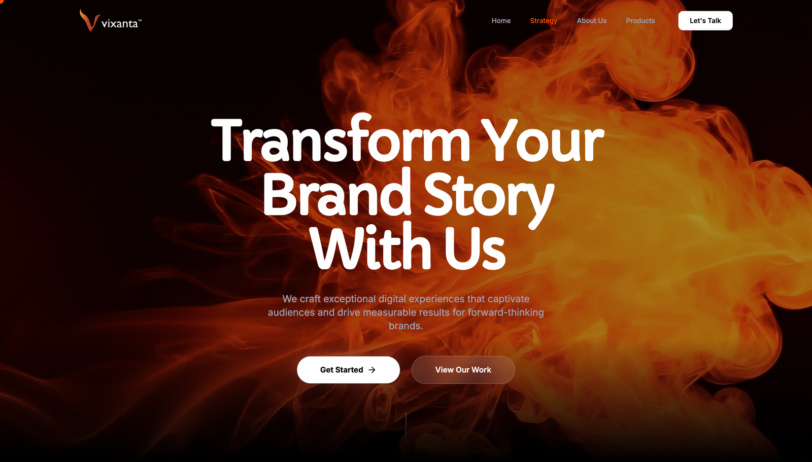
The identity started with color. I designed a range of directions, and the one that kept pulling everyone back was a confident neon orange against deep black. It felt awake. It felt like a company with energy to burn rather than one trying to look safe.
The logo took longer, the way the important things always do. My first version was clean and blocky, professional in the way that does not offend anyone and does not move anyone either. I knew it was not right, so I went back in. The second direction became a phoenix folded into a V, a flame and a letter sharing the same shape. That was the one. It said exactly what the company wanted to feel like. Something rising, something with heat behind it. They loved it, and around it the rest fell into place. Type, system, the full identity, all pulling in one direction at last.
Bringing it to life on the web
Phase two turned the freelance brief into an internship, and the brand into a website. I designed and built the full site from scratch, with the creative control to decide how the whole thing should feel. The hero leads with a flame video moving quietly behind the type, the orange and black carrying through every section, the brand finally living and breathing instead of sitting still in a guidelines file.
Every page led with intent. What they do before how they do it. The problem each thing solves before the features behind it. A site that did not just describe the company but actually felt like the company, which is the whole point of taking a brand all the way from zero to live.
Live
The best part of this project was the constraint of having none. Starting from absolute zero meant every decision was mine to make and mine to defend, and that taught me more than any tidy brief ever could. Brand and product could not be separated here. The website only worked because the brand worked, and the brand only worked because someone finally decided what the company was allowed to feel like.
They asked me to stay on full-time after the internship. I was grateful, and I chose to keep growing elsewhere. Sometimes the best work is the work that quietly sets you up for whatever comes next.
The Vixanta site is live at vixanta.com.